Selectors
A selector represents a structure. This structure can be used as a condition (e.g. in a CSS rule) that determines which elements a selector matches in the document tree, or as a flat description of the HTML or XML fragment corresponding to that structure.
—W3C
Selectors
Invalid selectors
Avoid qualifying selectors
Avoid !important
Use shorthand properties
Related concepts
Values and units
Box model and margin collapse
Containing block, stacking and block-formating context
Shorthand properties
Selectors
Explore selectors, the different ways you can target (select) which element or elements you want to style, to change the values for some of the properties.
We can divide CSS selectors into five categories:
- Simple selectors (select elements based on name, id, class) Examples:
universal selector * {}type (tag name) selector h1 {}class selector .my-class {}id selector #my-id {} - Combinator selectors (select elements based on a specific relationship between them)
descendant selector article p {}all P that are descendants of ARTICLE child selector article > p {}all P that are children of ARTICLE adjacent sibling .agenda dt + dd {}DD immediately after DT (that are descendants of class agenda) general sibling .agenda dt ~ dd {}all DD after DT (that are descendants of class agenda) - Pseudo-class selectors (select elements based on a certain state)
linguistic directionality :dir(), language:lang()user action pointer hover :hover, activation:active, inputfocus:focusinput input control states :enabled,:disabled,
input value states:checked,
input value-checking:valid,:invalid,:required,:in-range,:out-of-rangetree-structural :root,:empty,
child-indexed:nth-child(),:first-child(),…
typed child-indexed:nth-of-type(),:first-of-type(),… - Pseudo-element selectors (select and style a part of an element)
Pseudo-elements represent abstract elements of the document beyond those elements explicitly created by the document language. Including ::first-letter,::first-line,::before,::after. Explore further: CSS Pseudo-Elements Module —W3C. - Attribute selectors (select elements based on an attribute or attribute value)
attribute presence [placeholder] {}represents an element with the placeholder attribute, whatever the value of the attribute Substring matching [placeholder^="Enter"] {}represents an element with the placeholder attribute, whose value begins with "Enter" [placeholder$=".html"] {}represents an element with the placeholder attribute, whose value ends with ".html" [placeholder*="banana"] {}represents an element with the placeholder attribute, whose value contains the substring "banana"
There is a variety of ways to combine selectors. The most common is the Selector list, a comma-separated list of selectors. When several selectors share the same declarations, they may be grouped into a comma-separated list.
| selector list | h1, p, li, a {} |
all H1, all P, all LI, and all A |
For a full list, explore 2. Selectors Overview —W3C
Invalid selectors
What happens with invalid selectors? Read on W3C.
In addition to invalid selectors, you could have selectors that cannot exist (validation error):
h1 h2 {} /* HTML validation error */
a p () /* HTML validation error */
ul > ol /* HTML validation error */
Avoid qualifying selectors
div.nav { } /* AVOID */
.nav { } /* Preferred */
Avoid !important
p { margin: 0 !important; } /* AVOID */Use shorthand properties
body {
  margin-top: 20px;  /* AVOID */
  margin-right: 10px;
  margin-bottom: 20px;
  margin-left: 10px;
}

body {
  margin: 20px 10px;  /* Preferred */
}
Avoid IDs
#header { } /* AVOID */
.header { } /* Preferred */
Values and Units
The CSS module describes the common values and units that CSS properties accept and the syntax used for describing them in CSS property definitions.
Distance Units: the <length> type
Lengths refer to distance measurements and are denoted by <length> in the property definitions. (more details at W3C)
Relative length units specify a length relative to another length. Style sheets that use relative units can more easily scale from one output environment to another. em, ex, ch, rem, vw, vh, vmin, vmax
/* Font-relative Lengths:  em, ex, ch, rem  */
h1 {line-height: 1.2em}  /* the line height will be 20% greater than the font size of h1 element */
h1 {font-size: 1.2em}/* font size will be 20% greater than the computed font size inherited from h1 elements */
/* Viewport-percentage Lengths:  vw, vh, vmin, vmax units  */
h1 { font-size: 8vw } /* the width of the viewport is 200mm, the font size will be 16mm; i.e.(8x200mm)/100 */
Absolute length units are fixed in relation to each other and anchored to some physical measurement. They are mainly useful when the output environment is known. The absolute units consist of the physical units (in, cm, mm, pt, pc, Q) and the visual angle unit (px):
h1 { margin: 0.5in }      /* inches | 1in = 2.54cm = 96px */
h2 { line-height: 3cm }   /* centimeters | 1cm = 96px/2.54 */
h3 { word-spacing: 4mm }  /* millimeters | 1mm = 1/10th of 1cm */
h3 { letter-spacing: 1Q } /* quarter-millimeters  | 1Q = 1/40th of 1cm*/
h4 { font-size: 12pt }    /* points | 1pt = 1/72th of 1in */
h4 { font-size: 1pc }     /* picas | 1pc = 1/6th of 1in */
p  { font-size: 12px }    /* px | 1px = 1/96th of 1in */
Quoted Strings: the <string> type
(more details at W3C)
content: "this is a 'string'.";
content: "this is a \"string\".";
content: 'this is a "string".';
content: 'this is a \'string\'.'
Resource Locators: the <url> type
(more details at W3C)
background: url("http://www.example.com/pinkish.gif");
background: url(http://www.example.com/pinkish.gif);
CSS-wide keywords: initial, inherit and unset
(more details at W3C)
Basic color keywords
The list of basic color keywords is: aqua, black, blue, fuchsia, gray, green, lime, maroon, navy, olive, purple, red, silver, teal, white, and yellow; plus many extended color keywords. (more details at W3C)
body {color: black; background: white }
h1 { color: maroon }
h2 { color: olive }
Numerical color values
RGB color values (more details at W3C)
em { color: #f00 }              /* (hexadecimal) #rgb */
em { color: #ff0000 }           /* (hexadecimal) #rrggbb */
em { color: rgb(255,0,0) }      /* (decimal) integer range 0 - 255 */
em { color: rgb(100%, 0%, 0%) } /* float range 0.0% - 100.0% */
RGBA color values (more details at W3C)
em { color: rgb(255,0,0) }      /* integer range 0 - 255 */
em { color: rgba(255,0,0,1)     /* the same, with explicit opacity of 1 */
em { color: rgb(100%,0%,0%) }   /* float range 0.0% - 100.0% */
em { color: rgba(100%,0%,0%,1) } /* the same, with explicit opacity of 1 */
HSL color values (more details at W3C)
HSL colors are encoding as a triple (hue, saturation, lightness)
* { color: hsl(0, 100%, 50%) }   /* red */
* { color: hsl(120, 100%, 50%) } /* lime */
* { color: hsl(120, 100%, 25%) } /* dark green */
* { color: hsl(120, 100%, 75%) } /* light green */
* { color: hsl(120, 75%, 75%) }  /* pastel green, and so on */
HSLA color values (more details at W3C)
em { color: hsl(120, 100%, 50%) }     /* green */
em { color: hsla(120, 100%, 50%, 1) } /* the same, with explicit opacity of 1 */
p { color: hsla(240, 100%, 50%, 0.5) } /* semi-transparent solid blue */
p { color: hsla(30, 100%, 50%, 0.1) }  /* very transparent solid orange */
Box model and Margin collapse
Box model
All HTML elements can be considered as boxes. In CSS, the term "box model" is used when talking about design and layout. The CSS box model is essentially a box that wraps around every HTML element. It consists of: margins, borders, padding, and the actual content. w3schools.com
- Content box
- The area where your content is displayed, which can be sized using properties like width and height. (box-sizing property?)
- Padding box
- The padding sits around the content as white space; its size can be controlled using padding and related properties.
- Border box
- The border box wraps the content and any padding. Its size and style can be controlled using border and related properties.
- Margin box
- The margin is the outermost layer, wrapping the content, padding and border as whitespace between this box and other elements. Its size can be controlled using margin and related properties.
Margin collapse
[missing]
Containing Block, Stacking and block-formating context
The position and size of an element's box(es) are sometimes calculated relative to a certain rectangle, called the containing block of the element. The containing block of an element is defined as …
www.w3.orgBlock formatting context
A block formatting context is a part of a visual CSS rendering of a web page. It's the region in which the layout of block boxes occurs and in which floats interact with other elements. A block formatting context is created by at least one of the following:
Read further developer.mozilla.orgThe stacking context
The stacking context is a three-dimensional conceptualization of HTML elements along an imaginary z-axis relative to the user, who is assumed to be facing the viewport or the webpage. HTML elements occupy this space in priority order based on element attributes.
Read further developer.mozilla.orgInline vs. block behaviour
The display property specifies the display behavior (the type of rendering box) of an element. In HTML, the default display property value is taken from the HTML specifications or from the browser and user default style sheet. Explore more— w3schools.com
- inline
- Displays an element as an inline element (like <span>). Any height and width properties will have no effect
- block
- Displays an element as a block element (like <p>). It starts on a new line, and takes up the whole width
Shorthand properties
Use the sequence TRBL (TRouBLe, clockwise) to specify values for the block sides; applies to properties margin and padding.
property: top right bottom left;
property: top right+left bottom;
property: top+bottom right+left;
property: all4same;
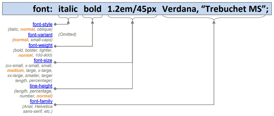
Other important shorthand properties: border, outline, font, background
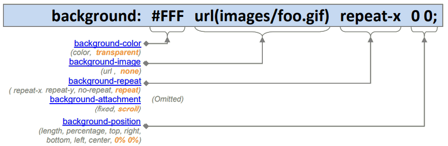
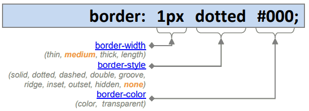
- Since the default border-style is none, omitting it will not render a border.
- Border-width, border-style, and border-color are themselves shortcuts as they allow you to combine the four (top, right, bottom, and left) border statements into one. For example, border-width: 2px equals border-top-width:2px, border-right-width:2px, border-bottom-width:2px, border-left-width:2px.