Layout properties and techniques
Layout Techniques
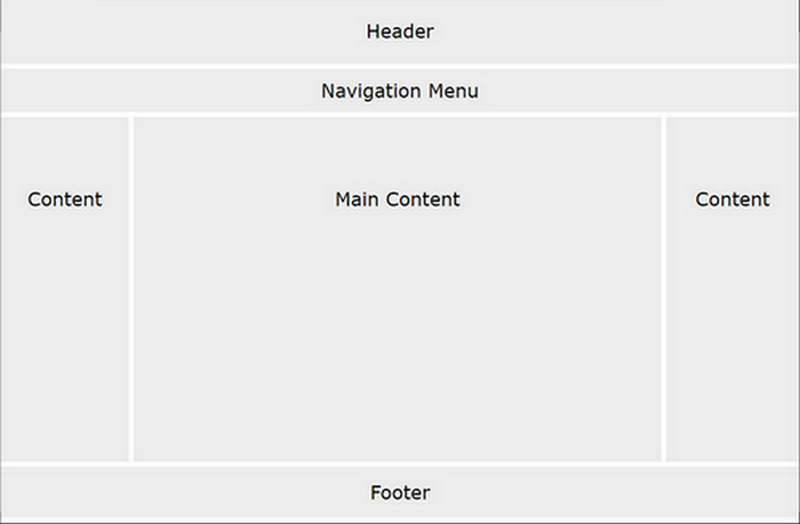
There are different ways to create multi-column layouts. Each way has its pros and cons.
- HTML tables
- CSS float property
- CSS framework
- CSS flexbox
- CSS grid
https://www.w3schools.com/css/css_website_layout.asp
Regardless of the chosen technique, follow the sequence of steps:
- Start with well-formed and valid HTML5 code with appropriate comments.
- Consider the general CSS rules first.
- Apply the desired values for positioning of the content.
- Use a technique (flexbox, grid,...) to layout the page.
- Add finishing touches...
Styling tables
- To specify table borders in CSS, use the
borderproperty. - The
border-collapseproperty sets whether the table borders should be collapsed into a single border - Width and height of a table are defined by the
widthandheightproperties. - The
text-alignproperty sets the horizontal alignment (like left, right, or center) of the content in <th> or <td>. - The
vertical-alignproperty sets the vertical alignment (like top, bottom, or middle) of the content in <th> or <td>. - To control the space between the border and the content in a table, use the
paddingproperty on <td> and <th> elements. - Add the
border-bottomproperty to <th> and <td> for horizontal dividers - Use the
:hoverselector on <tr> to highlight table rows on mouse over - For zebra-striped tables, use the
nth-child()selector and add abackground-colorproperty to all even (or odd) table rows
Explore the examples @w3schools
Explore the Tables Tutorial on @w3.org Web Accessibility Initiative
Float property
The CSS float property specifies how an element should float.
The CSS clear property specifies what elements can float beside the cleared element and on which side.
Explore the examples @w3schools
Explore the specification @W3.org (Cascading Style Sheets Level 2 Revision 2 (CSS 2.2) Specification)
CSS Flexbox layout
Before the Flexbox Layout module, there were four layout modes:
- Block, for sections in a webpage
- Inline, for text
- Table, for two-dimensional table data
- Positioned, for explicit position of an element
The Flexible Box Layout Module, makes it easier to design flexible responsive layout structure without using float or positioning. To start using the Flexbox model, you need to first define a flex container. The flex container becomes flexible by setting the display property to flex.
The flex container properties are:
| flex-direction | flex-wrap | flex-flow | justify-content | align-items | align-content |
Explore the examples @w3schools
Explore the specifications on @W3.org
CSS Grid Layout
The CSS Grid Layout Module offers a grid-based layout system, with rows and columns, making it easier to design web pages without having to use floats and positioning.
- Grid Elements
- A grid layout consists of a parent element, with one or more child elements.
- Display Property
- An HTML element becomes a grid container when its display property is set to grid or inline-grid
- Grid Columns
- The vertical lines of grid items are called columns.
- Grid Rows
- The horizontal lines of grid items are called rows.
- Grid Gaps
- The spaces between each column/row are called gaps.
- Grid Lines
- The lines between columns are called column lines.
The lines between rows are called row lines.
To make an HTML element behave as a grid container, you have to set the display property to grid or inline-grid. Grid containers consist of grid items, placed inside columns and rows.
The grid property is a shorthand property for the following properties:
| grid-template-rows | grid-template-columns | grid-template-areas | grid-auto-rows | grid-auto-columns | grid-auto-flow |
Explore the examples @w3schools
Explore the specifications on @W3.org
Frameworks and libraries
Create own framework
Start with no styles. Identify what CSS Rules you will need. Generally, a custom-built framework can be smaller and cleaner, especially if you would use only 10 to 12 percent of an existing framework.
Start with well-formed and valid HTML5. Organize your CSS file (element) into sections. 1) imports and fonts first, 2) document layout, 3) specific areas, such as navigation, galleries, grids, buttons, ...
Practice building your own frameworks. It helps to select and determine when and how to use existing ones.
Use existing libraries
Check out some of the frameworks and libraries below. Some may require rudimentary skills for programming with Javascript. All require solid knowledge of HTML and CSS to use professionally.
Combining multiple libraries
The challenge of combining is to eliminate duplicates and minimize amount of code to include. Less code gives better performance.
Google Fonts
Discover great typography and iconography. Google Fonts makes it easy to bring personality and performance to your websites and products. Our robust catalog of open-source fonts and icons, makes it easy to integrate expressive type and icons seamlessly—no matter where you are in the world.
CSS Icons
Explore CSS icons on w3schools …how to add icons — font awesome, bootstrap, google.
Font Awesome icon library The next generation of the web’s favorite icon library + toolkit. Get vector icons and social logos on your website with Font Awesome, the web's most popular icon set and toolkit.
W3.CSS framework
W3.CSS is a modern, responsive, mobile first CSS framework, standard CSS only (No jQuery or JavaScript library). A Quality Alternative to Bootstrap W3.CSS is Smaller, Faster and Easier to Use.
To use, include the stylesheet on your pages: (contains some 230 CSS rules, file size 23.1 KB)
<link rel="stylesheet" href="https://www.w3schools.com/w3css/4/w3.css">
missing.css library
missing.css
is a simple CSS library that can be used in many ways. is a notch on the complexity slider that's just right for small projects and personal sites where classless CSS is not enough, Tailwind is too much and Bootstrap just doesn't have the right vibe.
To use, include the stylesheet on your pages: (file size 40 KB - Javascript library also available)
<link rel="stylesheet" href="https://unpkg.com/missing.css@1.0.9/dist/missing.min.css">
Bootstrap CSS framework
Tutorial on w3schools
Bootstrap is a free and popular HTML, CSS, and JavaScript framework for developing responsive, mobile-first websites. (the base file contains over 1000 CSS rules, file size 161 KB, plus themes and other libraries)
Tailwindcss framework
tailwindcss.com is a utility-first CSS framework packed with classes that can be composed to build any design, directly in your markup.
Hosted Libraries
Make sure you are comfortable with native CSS and rudimentary Javascript before delving into libraries.
The Google Hosted Libraries is a stable, reliable, high-speed, globally available content distribution network for the most popular, open-source JavaScript libraries. Google works directly with the key stakeholders for each library effort and accepts the latest versions as they are released.